Why Resetting Your Phone Is Important
Before selling or giving away your phone, it’s crucial to reset it to its factory settings to protect your personal information and ensure the new owner starts with a clean slate.

Resetting your phone erases all data, including contacts, messages, photos, and app settings, reducing the risk of identity theft or privacy breaches.
Steps to Reset Your Phone
Backup Your Data: Before resetting your phone, backup any important data you want to keep, such as photos, contacts, and documents. You can use cloud storage services or transfer files to your computer to ensure you don’t lose anything important.
Factory Reset: Once you’ve backed up your data, proceed to perform a factory reset on your phone. This can usually be done through the Settings menu under the “Reset” or “Backup & Reset” options. Follow the prompts to initiate the reset process, which will erase all data and restore your phone to its original factory settings.
Remove Your Accounts: Before handing over your phone, make sure to remove any accounts associated with it, such as Google accounts, iCloud accounts, or app accounts. This prevents the new owner from accessing your personal information or accounts linked to the device.
Additional Steps for Security
To ensure your phone is completely wiped clean before selling it, consider taking the following additional steps:
Encrypt Your Data: Encrypting your data before performing a factory reset adds an extra layer of security by scrambling your information, making it unreadable to anyone without the decryption key.
Verify Reset: After completing the factory reset, double-check to ensure all data has been erased and the phone is restored to its original settings. You can also remove the SIM card and any external storage devices to prevent any residual data from being accessed.

By following these steps, you can safely reset your phone before selling it, protecting your privacy and ensuring a smooth transition for the new owner.
Home Decor Trends That Most People Don’t Realize Are Outdated and Should Stay in the Past
Too Much Macramé
While macramé has become a bit popular lately, it’s unnecessary to decorate every wall in your home with it. Weaving is a beautiful art, but too much of it might be a bit overwhelming for the senses.
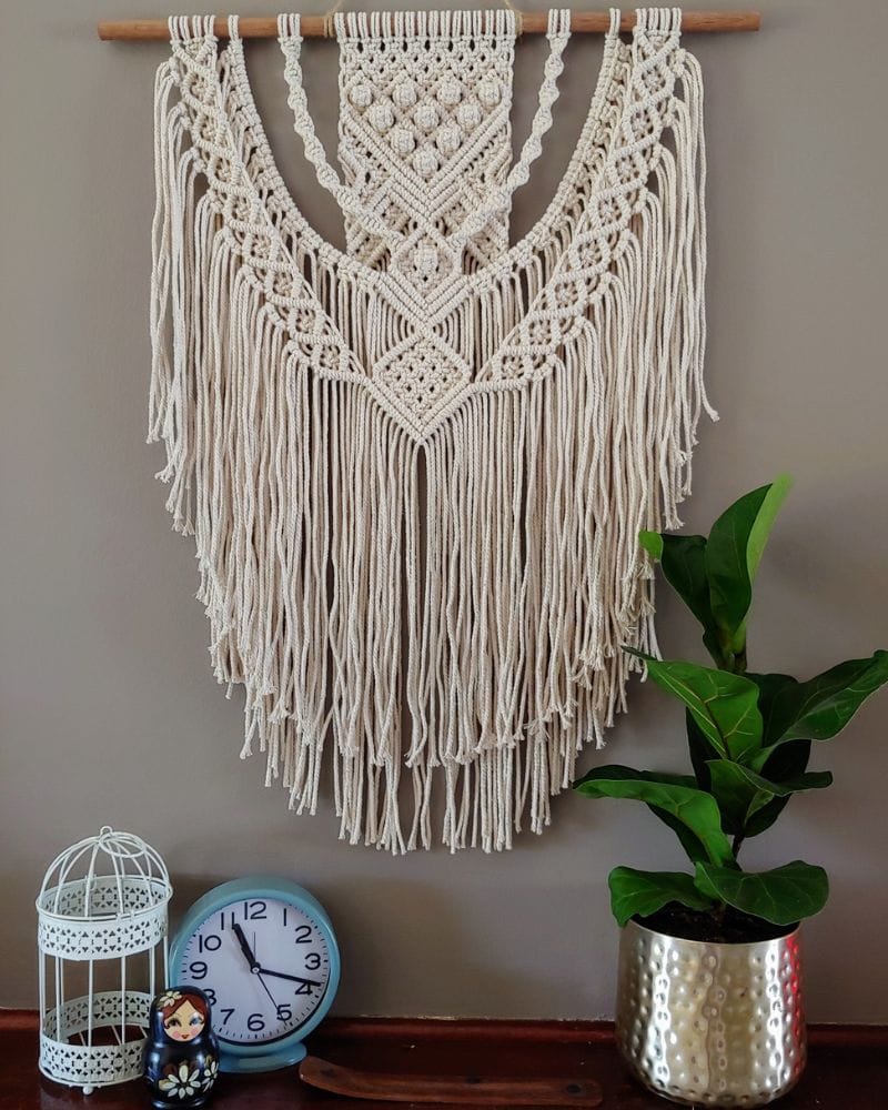
The problem with this woven art is that it can attract dust too easily, which will make it look a bit dull. It’s also not the most durable art you can hang on your walls, as it can easily be damaged.
Those Huge Leather Sofas
The oversized leather sofas may have been trending in the 70s, but it looks a bit out of place nowadays. That’s because these sofas are so huge that it occupies most of the free space that can be used for other things.
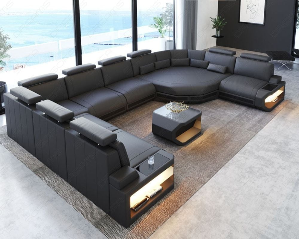
It may look beautiful and stylish, but having large sofas can easily look out of place and overwhelming. Leather might be durable and will always be a favorite in most setups, but too much of it isn’t always good.
Are Fringes Good?
Yes, some fringed decor items are beautiful and have been around for ages in homes all around the world, from mansions to cottages. The problem is that you can very easily go overboard and have too many of them, like a fringed tablecloth and all types of lampshades.
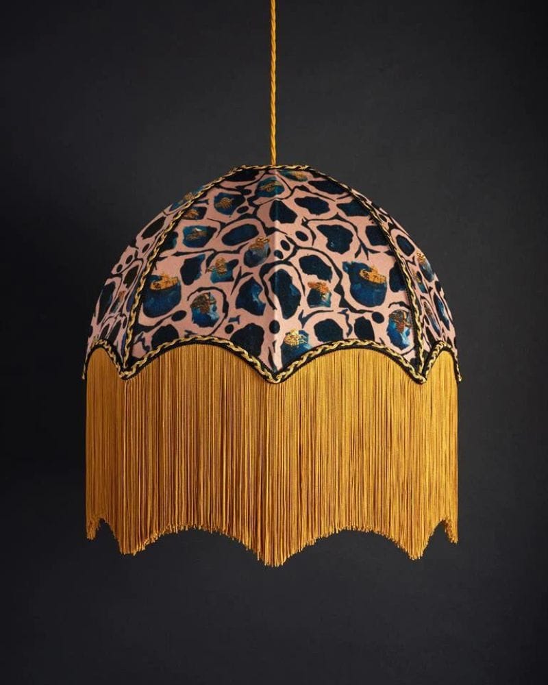
In some homes, it looks like everything has fringes on them and it might be a bit too much for the modern eye. The threads can also get damaged, making them look old and out of sorts.
Please, No More Animal Rugs
Adding animal rugs on the floor of your home may have been a great thing far in the past, but not anymore. You can’t just throw animal rugs onto the floor in your home; they won’t fit as well as you may think.
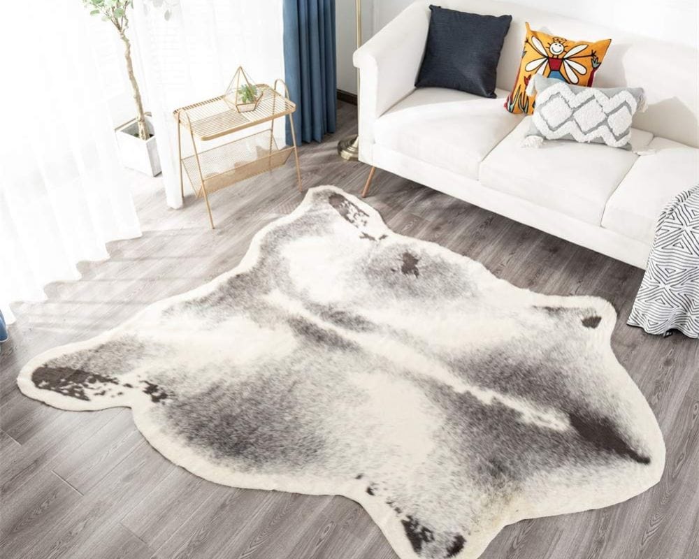
While it may also be quite expensive to have, it also isn’t really meant to improve the display of your home. Imagine how that animal skin will look out of place in your modern and airy home. Wouldn’t the animal prefer to wear their skin anyway?
Bright and Patterned Tiles
They may initially seem fun and exciting in your home, but these bright patterned floor tiles get old quickly. You’ll soon be tired of them and wonder why you chose this for the floor in your home in the first place.
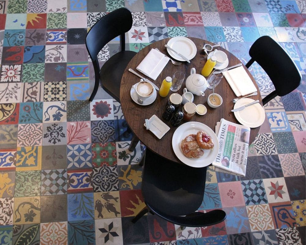
While this may make your home look like something from the rural tribes, it doesn’t really fit into the modern setup. Unfortunately, this will be a bit more difficult to remove than loose items like furniture and rugs.
No More Tuscan-Style
Not that we don’t like Tuscany, it’s stylish, but just a bit too dark for the modern kitchen for our senses. What’s in nowadays is an airy and light kitchen with simplicity as the main theme.
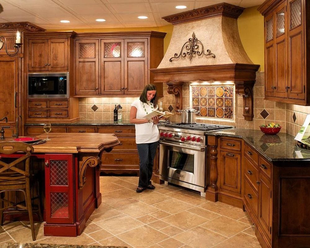
This design trend was great for the early 2000s, but we’ve outgrown that Italian country style and want a fresh air feel. A dark kitchen also always reminds you of the not-so-good things in human history.
Grandma’s Crotchet Blankets
Many of us had those itchy crotchet blankets most grandmas loved to make, but that’s not all. To improve that untrendy look, you often find them draped over the back of a sofa or on the end of the bed in older people’s homes.
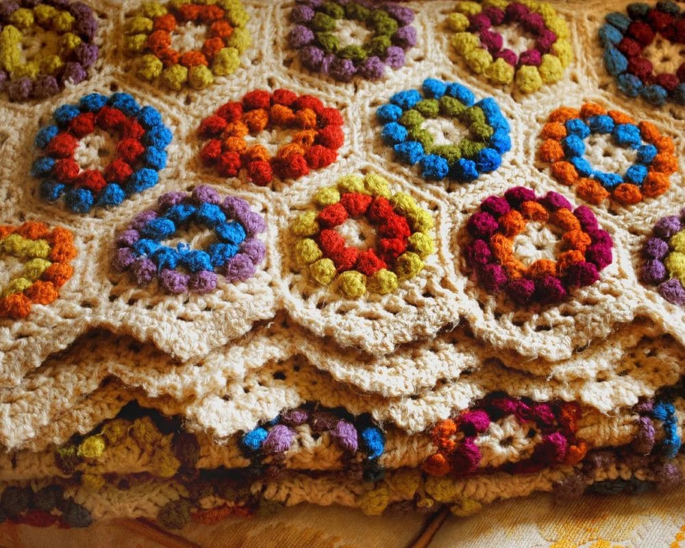
It may be popular among those who still love old stories like Little House on the Prairie, but they’re old and out of style. If you don’t want your home to look out of date, hide those crotchet blankets away where no one can see them.
Old Meeting Place
Conversation pits may have been something many people wanted in the 70s, but they’re not that popular anymore. To have a hole in the floor to entertain visitors is definitely not better than your open and airy living room.
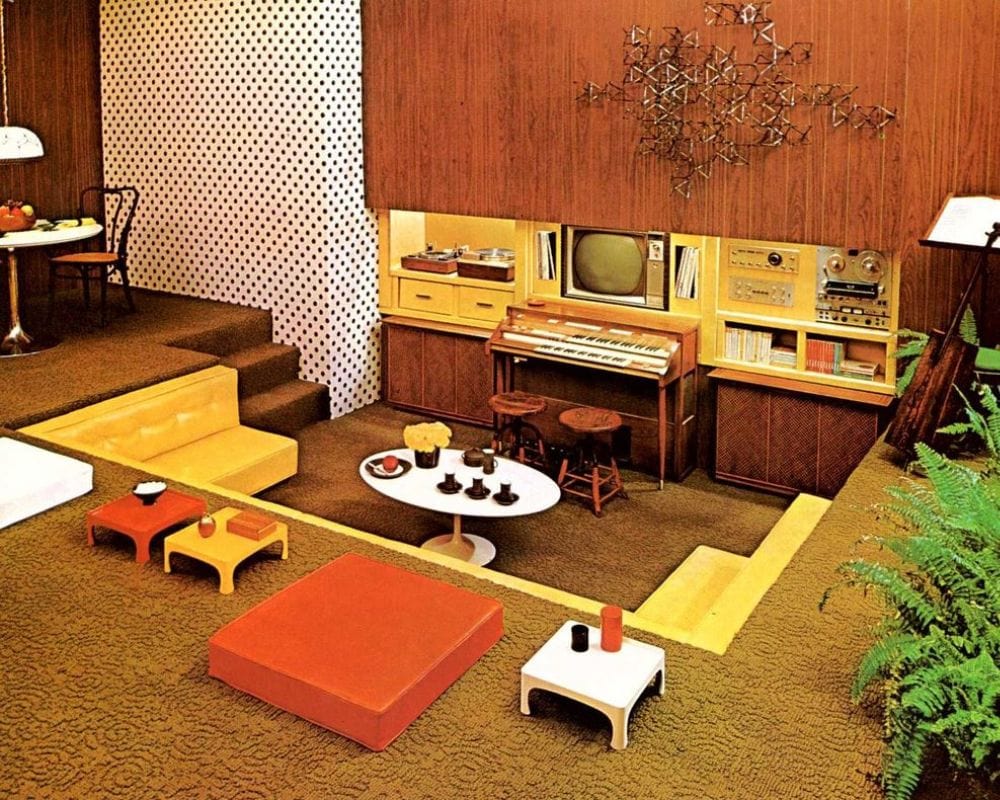
Rather spare your floor and create a corner in your home where everybody will feel perfectly at home when they visit you. They may even admire a beautifully covered floor rather than a hole where they feel unsafe.
The Chintz Look
Too much chintz fabric in your home will negatively influence the overall decor of any room. That’s especially the case with the living room, where it sometimes is a bit overwhelming for the senses.
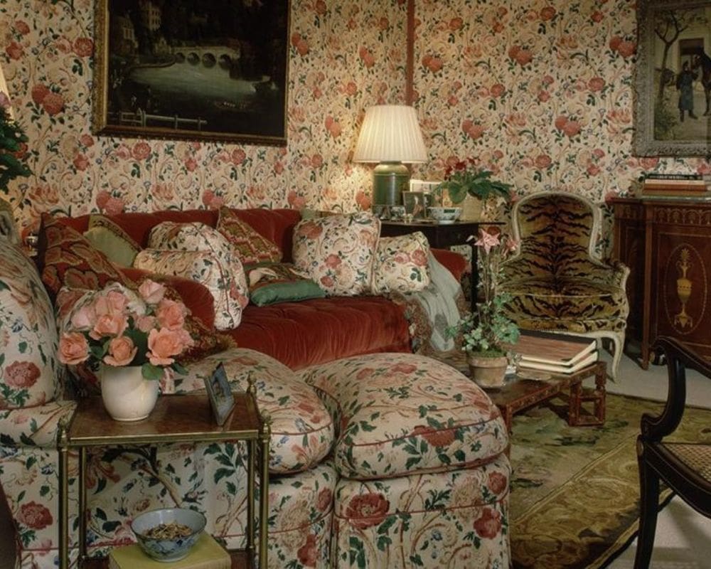
This multi-color fabric dates back to the 70s when it was popular, but this isn’t the case anymore and hasn’t been for decades. You don’t want to use too much of it in your modern home interior design. It’ll make your home decor look old.
Honey Oak Colors
Most kitchens in homes of the 90s looked like this; the popular color was honey oak on all-wood kitchen cupboards. This type of design can still be seen in many homes today, which is warm and homey but definitely something of the past.
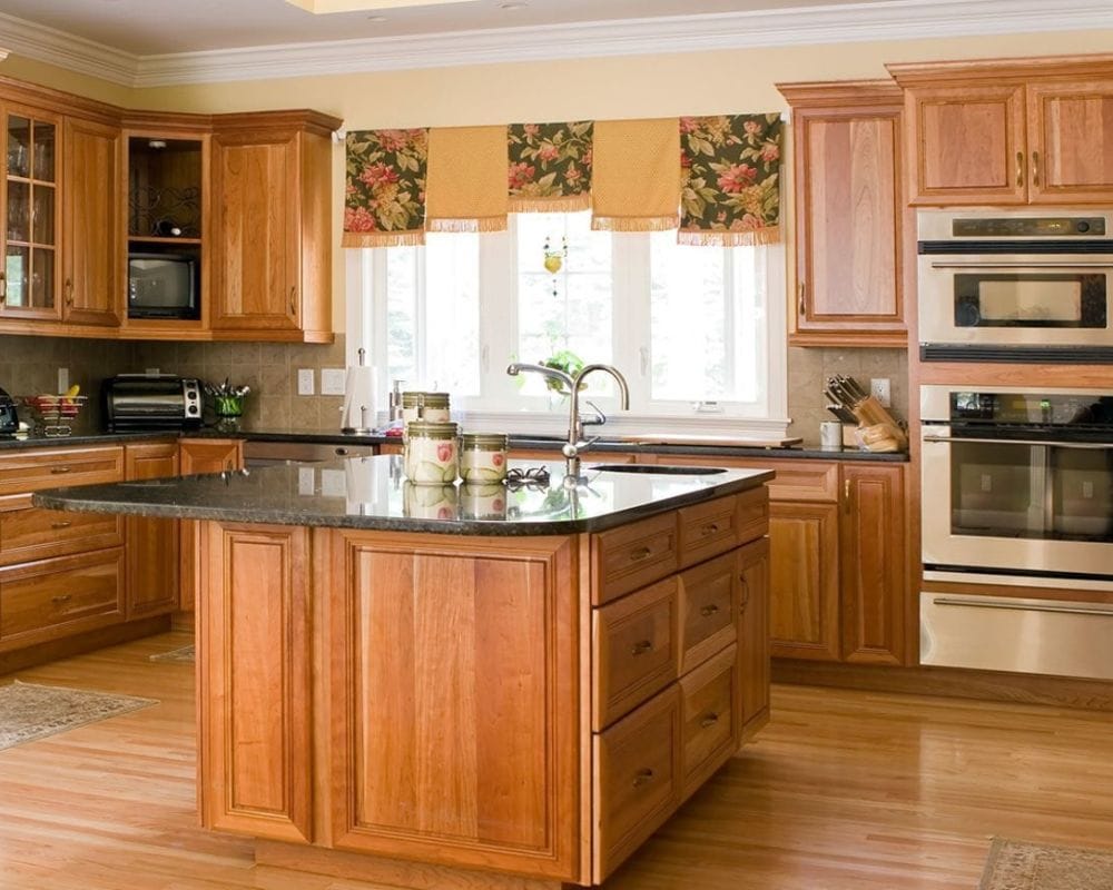
Even though they’re in the process of making a comeback, those dark countertops won’t stick for very long. Many different versions of stained oak are available to give your kitchen a more modern and aesthetically pleasing look.
Everybody Knows Your Name
The monogram motif is something you don’t want to get back to, even if it’s coming back. You don’t want any type of fabric draped over your furniture or anywhere in your home with your name or initials on it, and this includes towels in the bathroom.
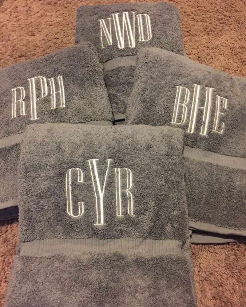
Almost everyone who comes into your home already knows your name, except for the rare stranger. Still, it doesn’t display well in any decor, and you should avoid adding that to any room in your home decoration setup.
Brightly Painted Walls
Rich, bright colors on every surface of your home will be a bit too much and might take you back to the 80s. You may think that you’re making a bold statement by adding bright colors to the walls and doors in your home, but they look outdated.
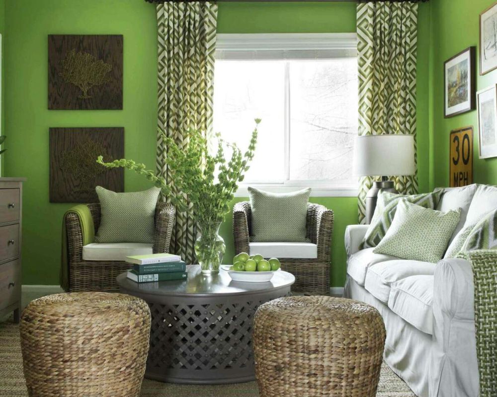
In some homes, even the kitchen and medicine cabinet in the bathroom is covered with these very bright colors. Milder colors are actually the more modern look, and this will be the case for many years.
Long-Haired Shag Carpets
They may feel great when walking on them barefoot, but these shag carpets are a nightmare to keep neat. We all know nowadays that carpets aren’t good for those with allergies, and this is especially true when it comes to shag carpets.
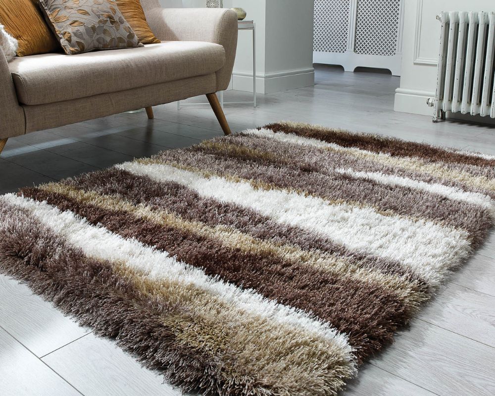
Besides the health problems involved, cleaning these carpets is also very expensive and needs to be done regularly. Hard floors have become very popular in modern homes anyway. So rather use a short rug that’s easy to clean if you need floor covering.
Stone Fireplace
A fireplace is always a good option for your home, but don’t take away the cozy look and feel with a stone wall surrounding it. You need to make the fireplace look warm, but that’s not going to happen with cold stone on the wall.
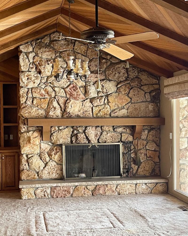
Some homes have these stonewalls around the fireplace going as high as the ceiling. This wall covering won’t give your living room a modern look. It was fine in the 70s, but not now.
Frilly Bed Skirts
It may have looked cozy in your grandmother’s home, but it’s not what you want in your modern bedroom. These bed skirts were a popular trend in the 80s, and everyone wanted them for their beds, especially young girls.
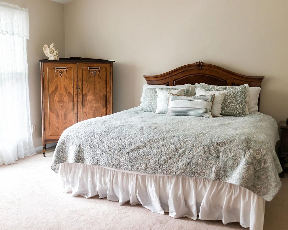
Minimalist decor, especially in the bedroom, is the best way to go. The simple decor will go a long way and can make even the smallest bedroom look spacious if you do it right.
The Ship Look
It might seem like a practical way to make your home lower maintenance, but shiplap makes your home look like a ship. There are much better-looking and more advanced methods you can use to make your home weatherproof.
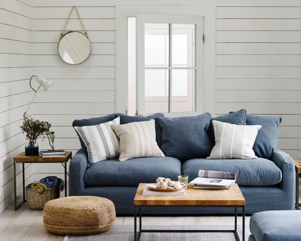
This went out of style because it makes your expensive brick-walled home look cheap, like a temporary place to live. This never was something you want to use inside your home; it’s better suited for outdoor structures.
Definitely Pink
While many women are following the trendsetters of the 90s with their everything-pink homes and outfits, it’s a dated look that ages badly. You may think that bright or bubblegum pink may look nice and is a lot of fun, but you’ll get tired of it.
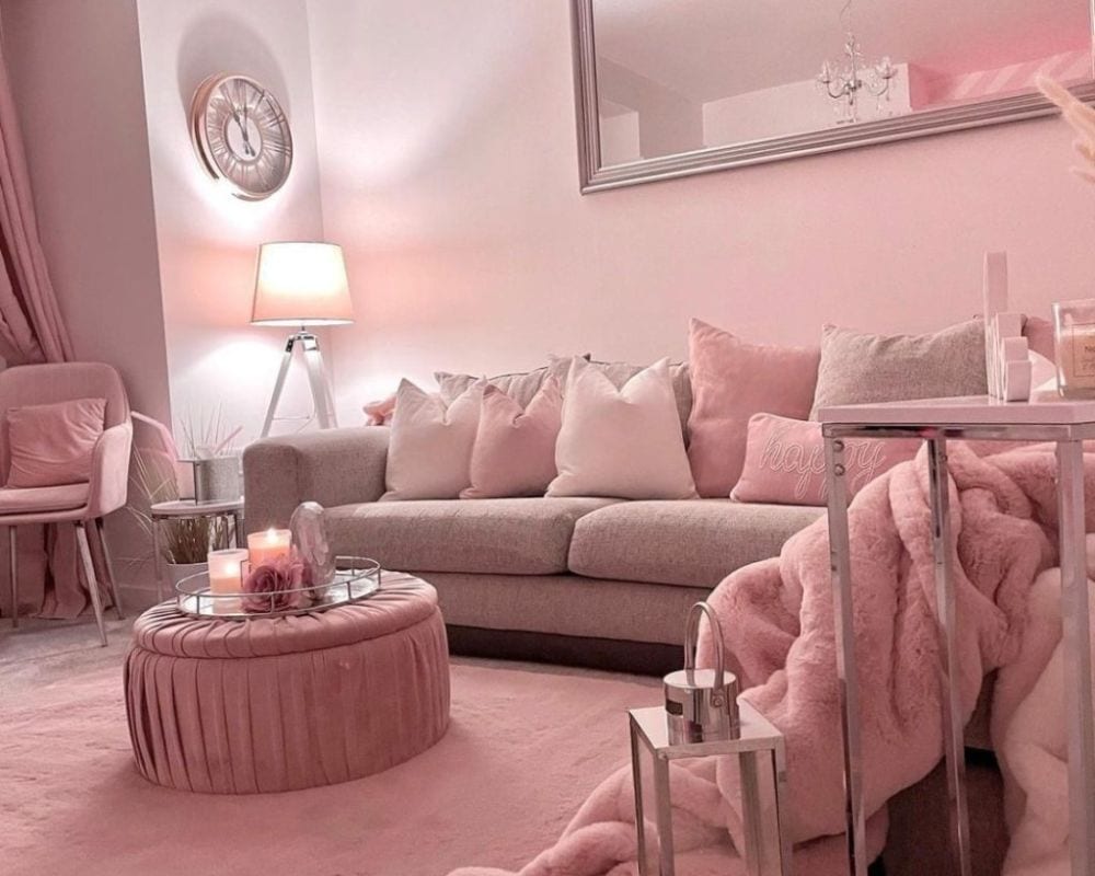
Shades like olive and mustard are becoming the colors you want to use in your home decor. They’re not as bold as pink, which is more suited for teenage girls from the 90s and early 2000s.
Bathtub Colors of Last Year
The cotton candy-colored bathtub was a trend many followed. People would paint their tubs pink or blue and it didn’t look great. This caused the bathroom to never really look clean, and the color gradually got worse after a few years of scrubbing.
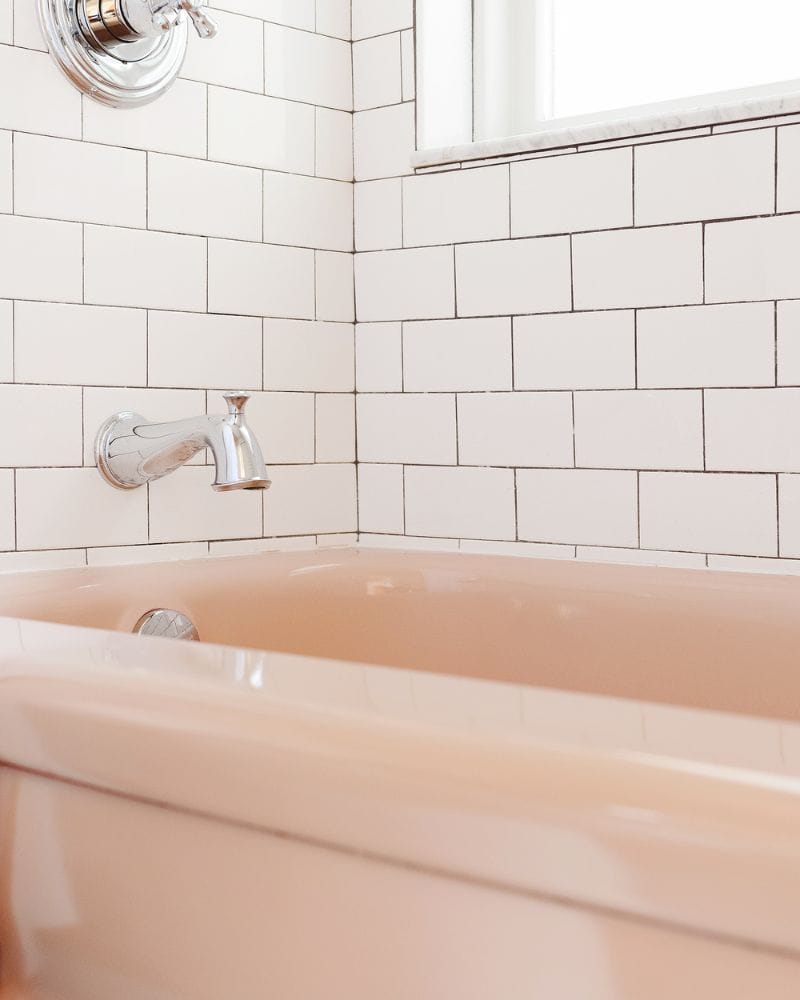
Rather stay with the safe white tub that’ll fit into any bathroom decor without looking out of place. Move away from the cotton candy look that didn’t stay in fashion for very long.
Animal Butler Side Tables
A doggy side table dressed like a butler may look cute, but it was something of the early 80s. Many people had these side tables in their homes, and some of them had even more than one.
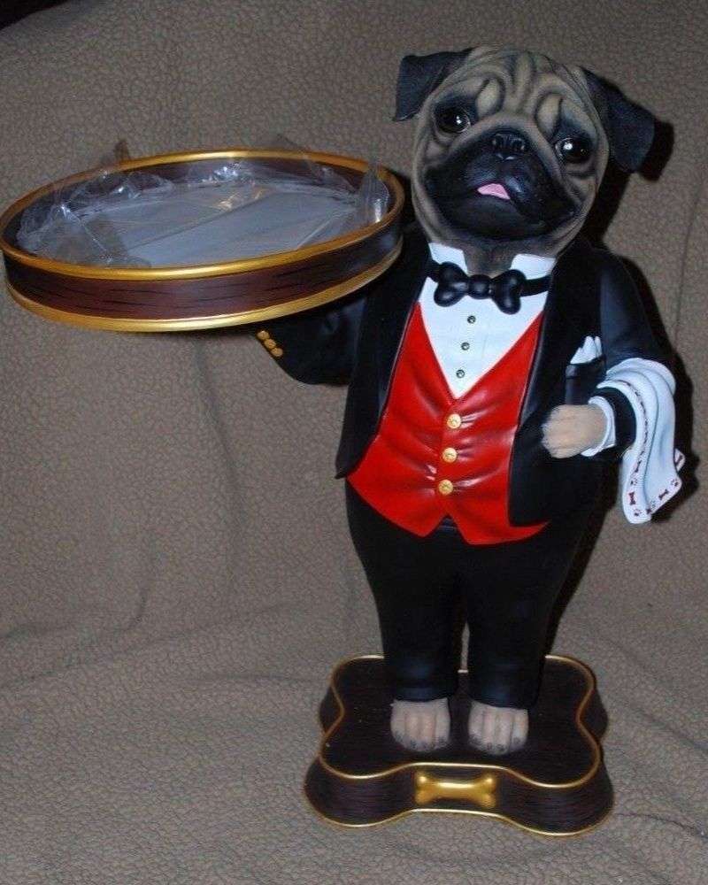
You definitely want to remove that from your home and sell them to collectors because they’re dated and look quite tacky. This type of decor doesn’t look good in modern homes where a smooth, clean, and spacious look is more acceptable.
Tiled Countertops
Someone thought it was a good idea to tile everything, including the countertops in the bathroom and kitchen. This wasn’t a good idea from the beginning because it’s difficult to clean the tiles and keep them germ-free.
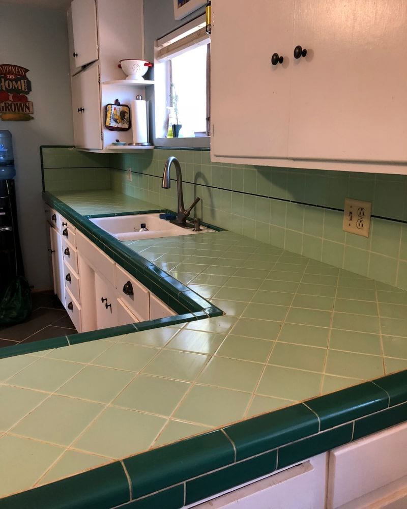
That was just one of the many reasons why this trend went out of style. Unfortunately, many homes still have them. The modern trends for countertops are quartz, marble, and granite, which are much easier to keep clean and display nicely. Whoever came up with this one needs to be fired!
Only for Visitors
Many of us grew up in a home where there was this one room that was off-limits to all children in the home. This room was reserved for special guests and was basically a show-off room with expensive displays that didn’t fit with the rest of the decor in the home.
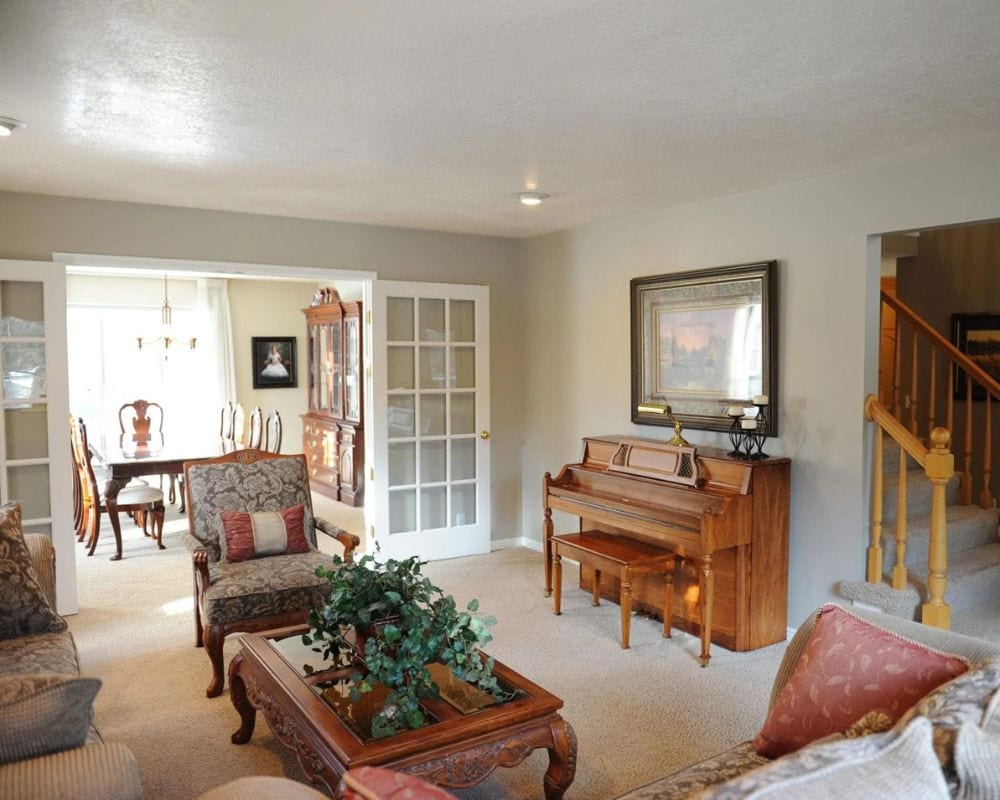
These days, that room is used by the whole family and can be used to entertain guests with much nicer-looking decor. It’s important that every space in the house is used to its full capacity and nothing should be off-limits to any house member.
Those Old Display Cabinets
In modern homes, older display cabinets or showcases look quite out of place and need to be tucked away somewhere in the back. Many older homeowners still have these showcases in their living rooms, where valuable collectibles are shown off and can easily be stolen.
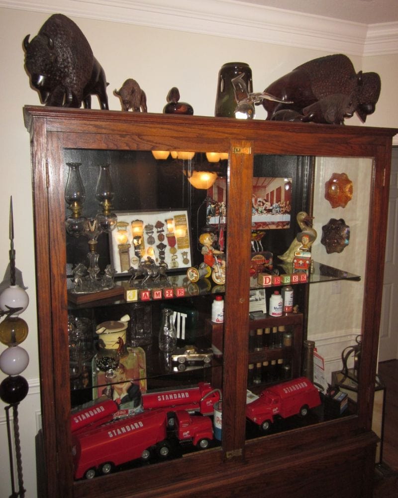
It’s true that some of those collectibles are worth a lot of money, but don’t display them out in the open. Those nice pieces will, in any case, be displayed much better all around the house.
Decorative Oil Bottles
In many homes, you’ll find these nicely shaped bottles containing spiced and herb oils in the kitchen on a rack. But these were never meant to be used and would be displayed on that shelf for many years, even after the contents are useable.
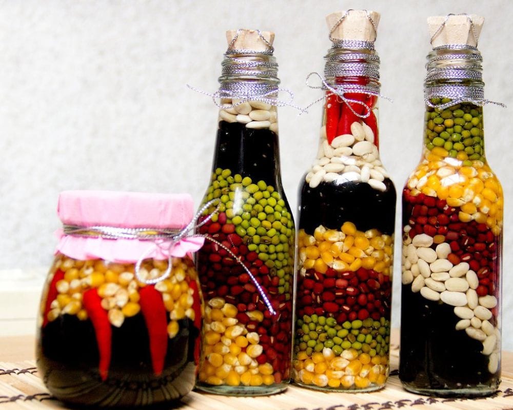
What was the use of those decorative oil bottles if the contents weren’t supposed to add flavor to your food? They’re just standing there collecting dust and looking out of place in any modern kitchen. Some people added contents, but again, why?!
Fruit Baskets on the Table
This was a trend of the 90s where you’d find a basket filled with fake fruit in basically every home you walked into. It looked out of place then and still doesn’t really find a place in the modern home.
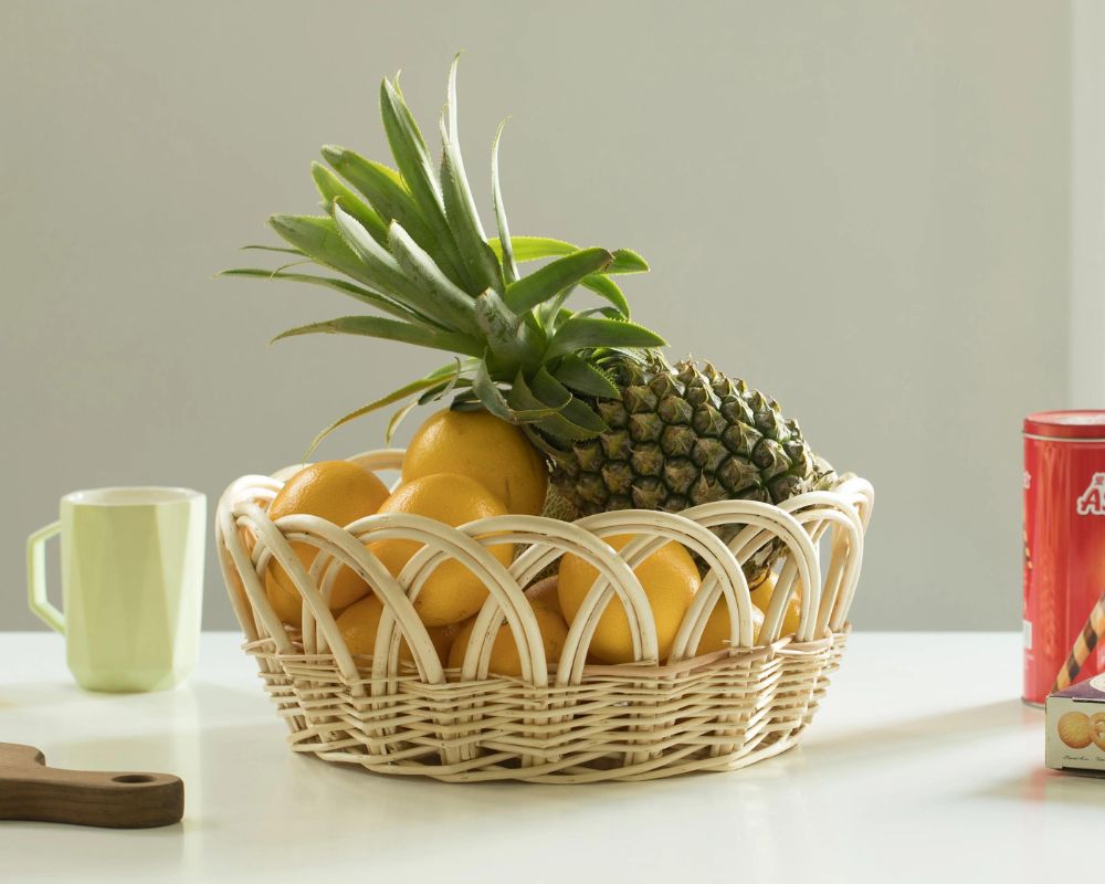
Rather, place a real fresh, juicy apple or pear and even a few bananas to add aesthetic value to your home. It’ll also entice your kids to eat healthy fruit rather than unhealthy sugary snacks.
Medieval-Style Decor
Large, oversized medieval-style chandeliers and other types of medieval decor that look more in place in castles aren’t for the modern home. This was a trend adopted by many homeowners in the early 2000s, but it never should’ve happened.
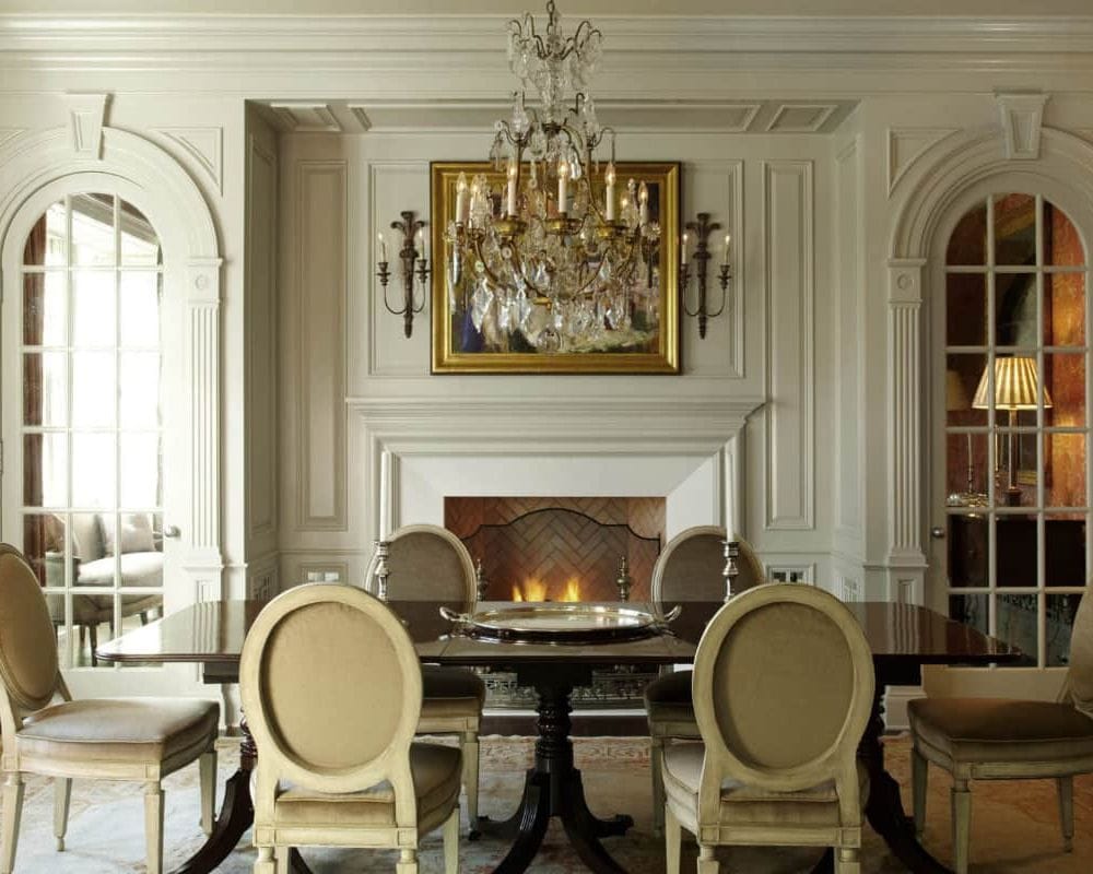
Those chandeliers and candle holders should never be used in modern society. Not to mention the safety risks they pose! Remove those unsightly and heavy pieces from the walls and ceilings, especially those on the outside that can easily rust in certain weather.
Shining Light Framed Mirror
Not even the small LED lights you get nowadays are the right option for any mirror in any room in your home. It’s definitely not for more mature women; even youngsters avoid having these lights because they’re so yesterday.
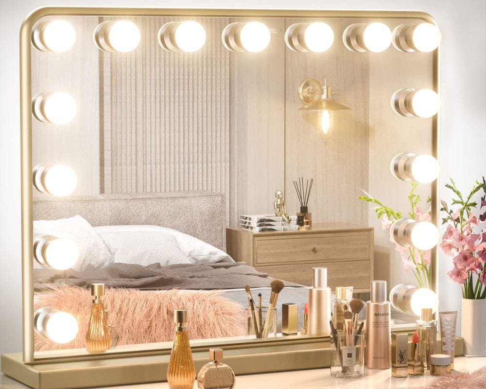
This picture shows many of those big bulbs that are out of style and out of place at any age. Leave them where they belong, in the past.
Eye-Catching Fan
Many years ago, fans were considered decor and placed in such a way that caught the eye. While fans are a necessity in warm areas, they have a sleek design to melt into the background.
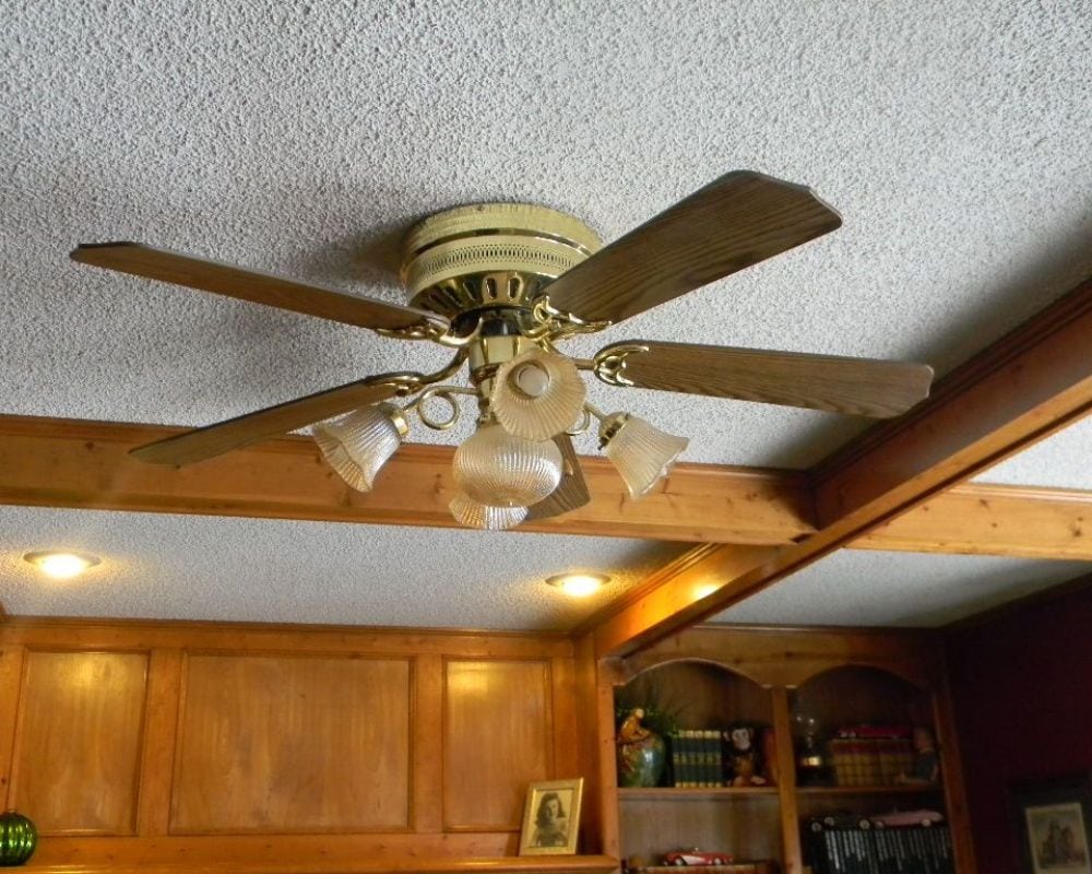
So, you don’t need to allow them to steal all the attention in a room. The days of those unsightly fans of yesterday are gone and have no place in the decor of modern homes.
Long Vertical Blinds
If they were ever considered proper decor, these blinds looked out of place in your home from the very beginning. Even if you have a home office, rather try out nice looking modern blinds.
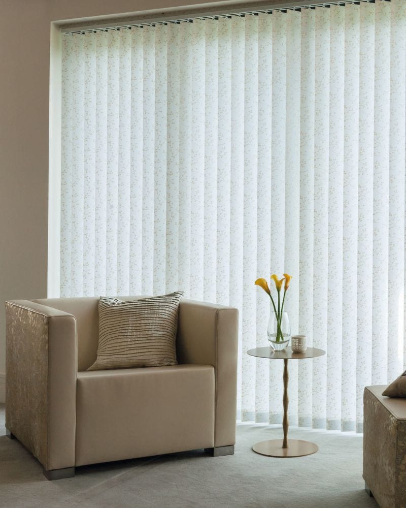
You need something that looks cozy, warm, and inviting in your living room, not this clinical approach. A nice curtain frame provides you with a better view in any case.
Blackboard on the Fridge
Your kitchen isn’t a classroom or even a children’s room where you need to entertain the kids. This thing is huge and ugly, and it takes up all the space on the front of your fridge.
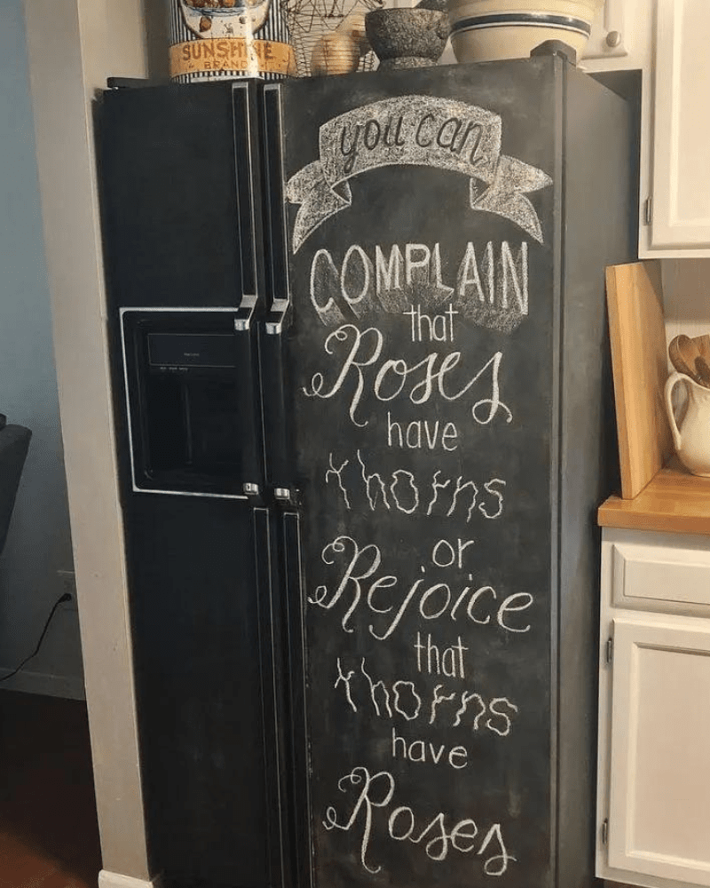
Or worse yet… when people painted their whole fridge to be a chalkboard. Small notes held with a decorative fridge magnet looks better. You can also make use of post-its that don’t take up space.
Ocean Decor at the Ocean
If you live far away from the sea and feel a bit nostalgic, this decor might work for a while. But right next to the sea, while you can hear it, is a bit too much.
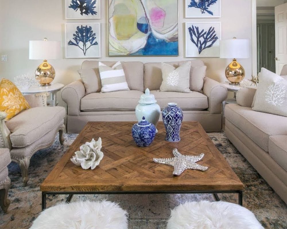
This type of sailor decor was popular for a while, but it’s old now. You’ll get tired of it anyway, and it belongs in the past. When we think of kitsch, this is exactly what comes to mind.
Shell-Shaped Sink
This is great for a while, but having this permanently attached will get boring. A seashell sink anywhere in your home may make people think you love the sea, but it gets old.
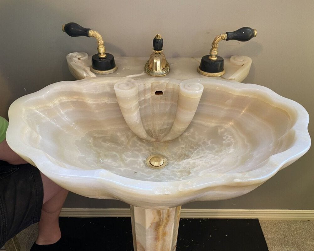
Shell-shaped sinks fell out of fashion after only a short time, and replacing them isn’t cheap. The many corners and small spaces are also difficult to clean.
Retire the Linoleum
For a while, linoleum was found in many homes, and they were great, but only for a while. This material is not immune to discoloration by the sun, so they become quite ugly.
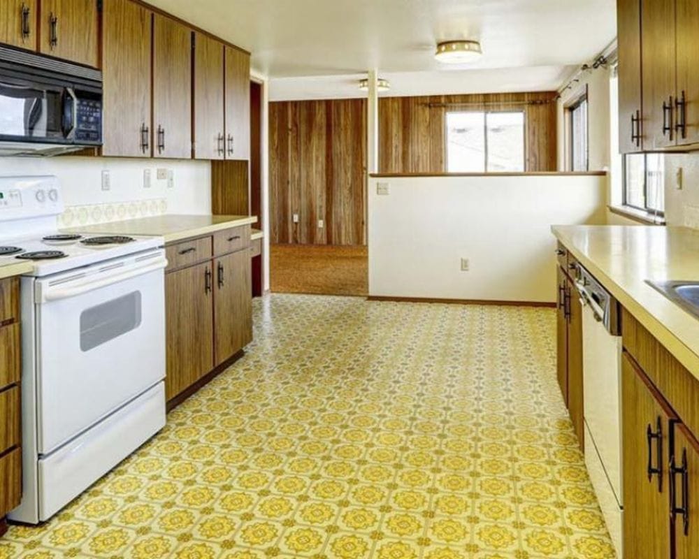
Linoleum is also not the most beautiful type of flooring you can have, especially when it’s in bright colors or that awful shade of yellow or orange. It’s time to move to beautiful modern flooring to adorn your home.
Confetti Walls
How do you teach your kids not to practice their inner artist on the walls in your home when you’ve chosen this type of print? This type of wallpaper may have been popular in the 90s but not anymore.
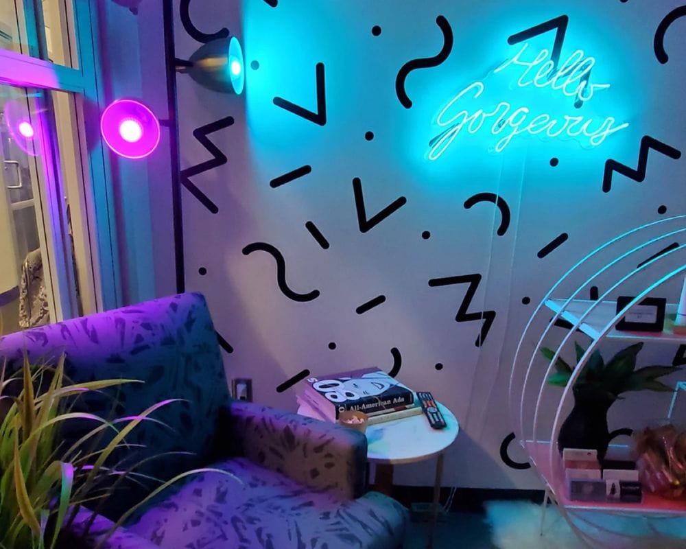
It reminds us of the sheets of our beds when we were small. This isn’t something you put in the modern home at all! Actually, it’s not something that anyone should put in any home ever.
Yesterday’s Pine Cupboards
The 80s and 90s are known for weird things, one of which is these pine kitchen cupboards. Many things from that era were made from pine, even bookshelves and other stuff made of wood.
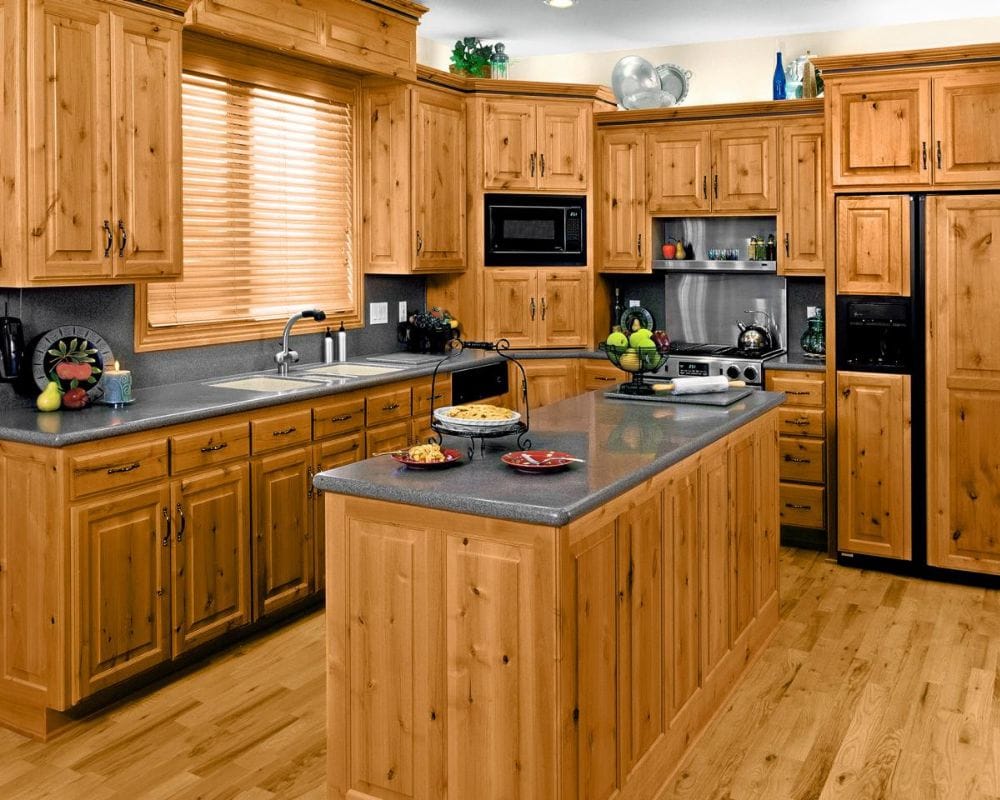
Many people believe that this is the ugliest and most boring wood you can find. It simply doesn’t work in furniture, not then and not now. The verdict is definitely in on this one and it’s a big ‘no!’
Huge Wall Units
Everything was huge a few decades ago, even the electronics for home entertainment. It’s no wonder they had to build these huge wall units to hold all those humongous things.
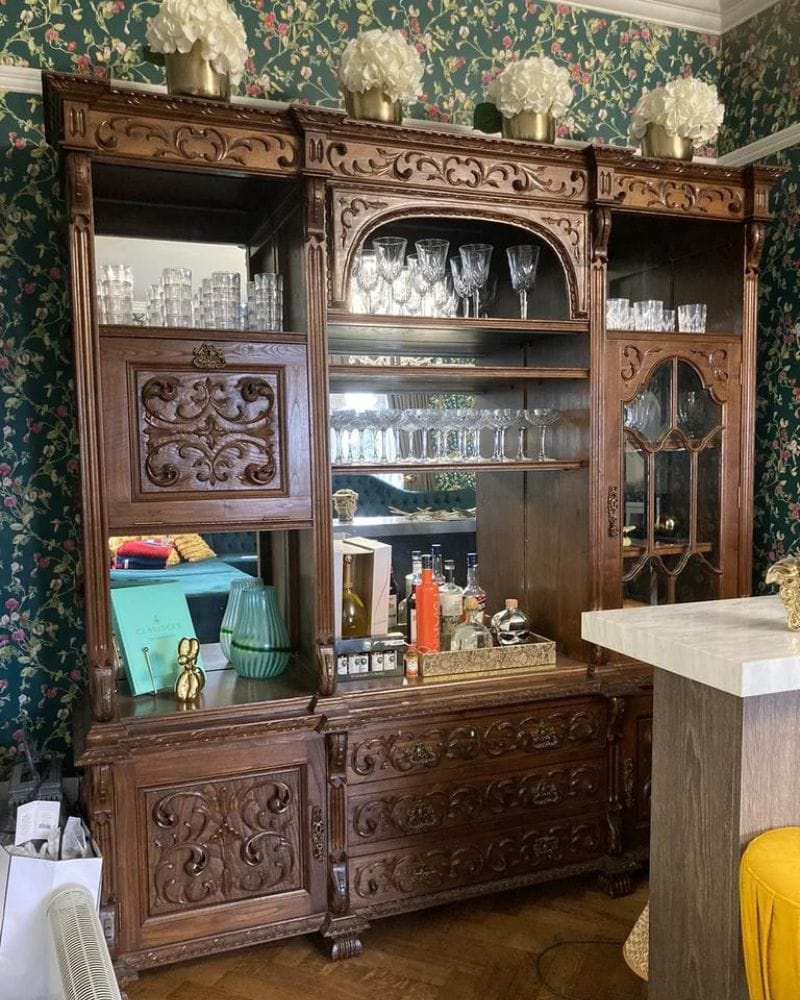
The wall units of the late 80s and 90s were designed to be wall-to-wall, which leaves no space for nice decor. Luckily, that changed so that we can get rid of those large things.
Too-Bright Colors
Bright colors in the kitchen were popular at some point; although we don’t know why. But it’s not part of home decor anymore. You don’t need to overwhelm the senses with it anymore.
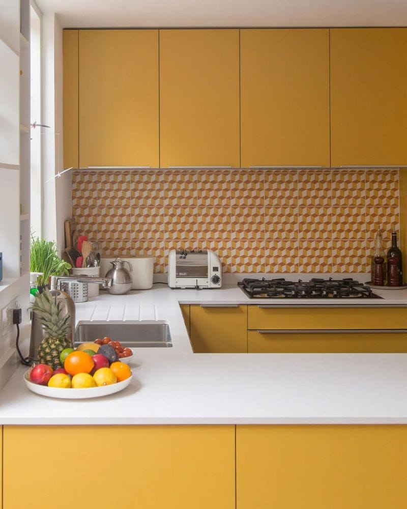
Neutral colors have looked much nicer and more welcoming for many years now. So, do yourself a favor and get rid of those dated-colored kitchen things.
Floating Steps
These steps look like they float in the air and are very unsafe, especially if you have kids or older family members. They don’t have a safety railing and surely don’t carry a lot of weight.
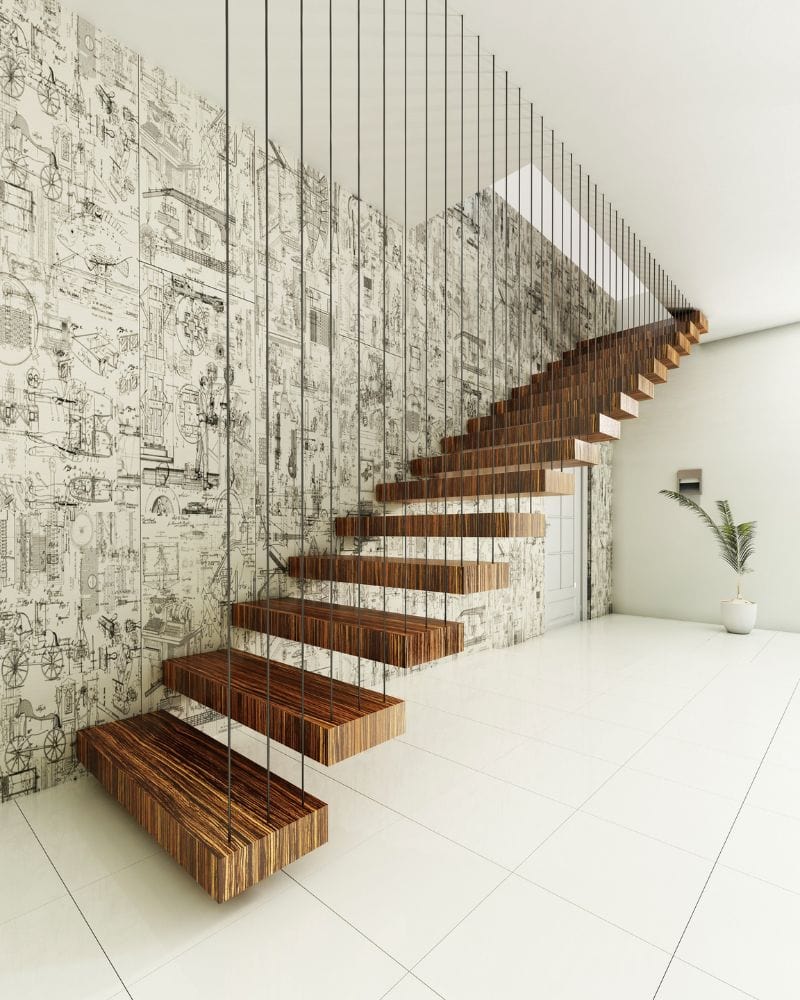
This must’ve been one of the worst ideas for interior decor for any home. Many thought they looked great but didn’t really use them for safety reasons. Who can blame them?
Wood Everywhere You Look
The 70s were famous for the use of a lot of wood for interior home decor; luckily, that’s over. Even though wood is nice and can be used for many purposes, too much of it isn’t good.
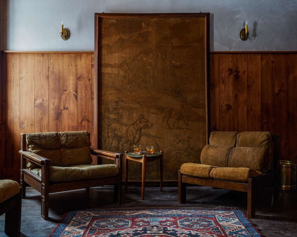
Look at this picture and tell us that this looks nice! Even the best wood lovers would agree it’s old. Rot and warp are but some of the problems you may encounter.
Gigantic Ornate Furniture
The urge to feel like royalty is taken a bit too far with this huge oversized ornate vase. The 2000s was the age when these types of highly ornate furniture became very popular.
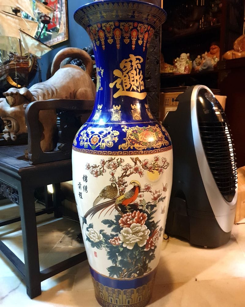
For this huge vase and other furniture, you’d need a hall to put it in to have space for your other stuff. Get rid of this, it’s too much. No one needs gigantic furniture, no matter what size your house may be.
Everything Is Floral
Floral prints for everything from curtains to sofas to vases were a fun thing to have in the 80s. Floral is still great but in very small amounts. Flowers everywhere aren’t really modern decor anymore.
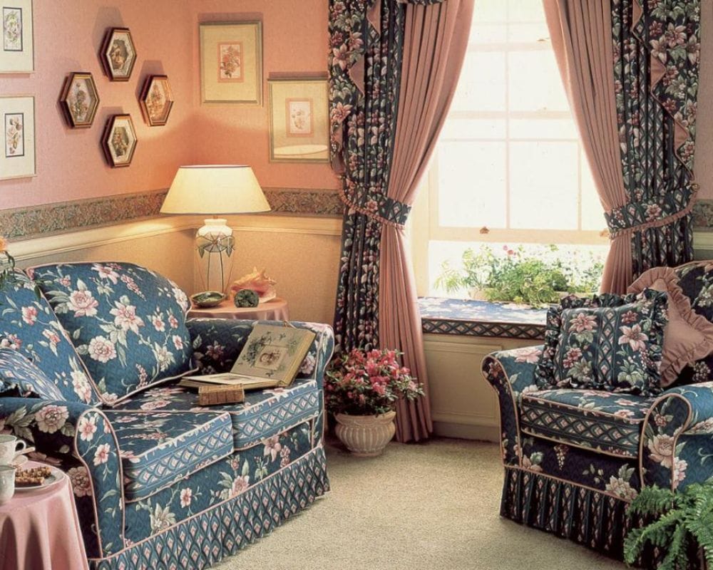
If you have this decor in your home, people may think you’re stuck in the 80s. Get something new that fits in this age of tech and warm earth tones.
Chaotic Patterns
These chaotic patterns from the 80s always looked a bit dirty, and they didn’t really provide a color palette. That’s why they shouldn’t be part of any home decor these days.
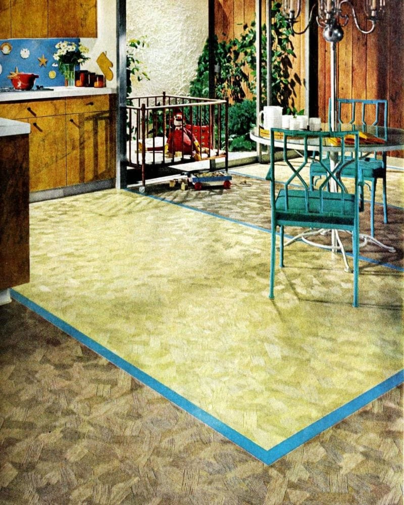
This type of decor didn’t provide you with inner peace and calm, because they always looked so chaotic. You’re much better off with neutral colors.
Dull-Looking Countertops
The laminate countertops of the 80s and 90s were rather dull in teal, pink, or even granite. They also weren’t very durable and chipped quite easily or simply got water damaged.
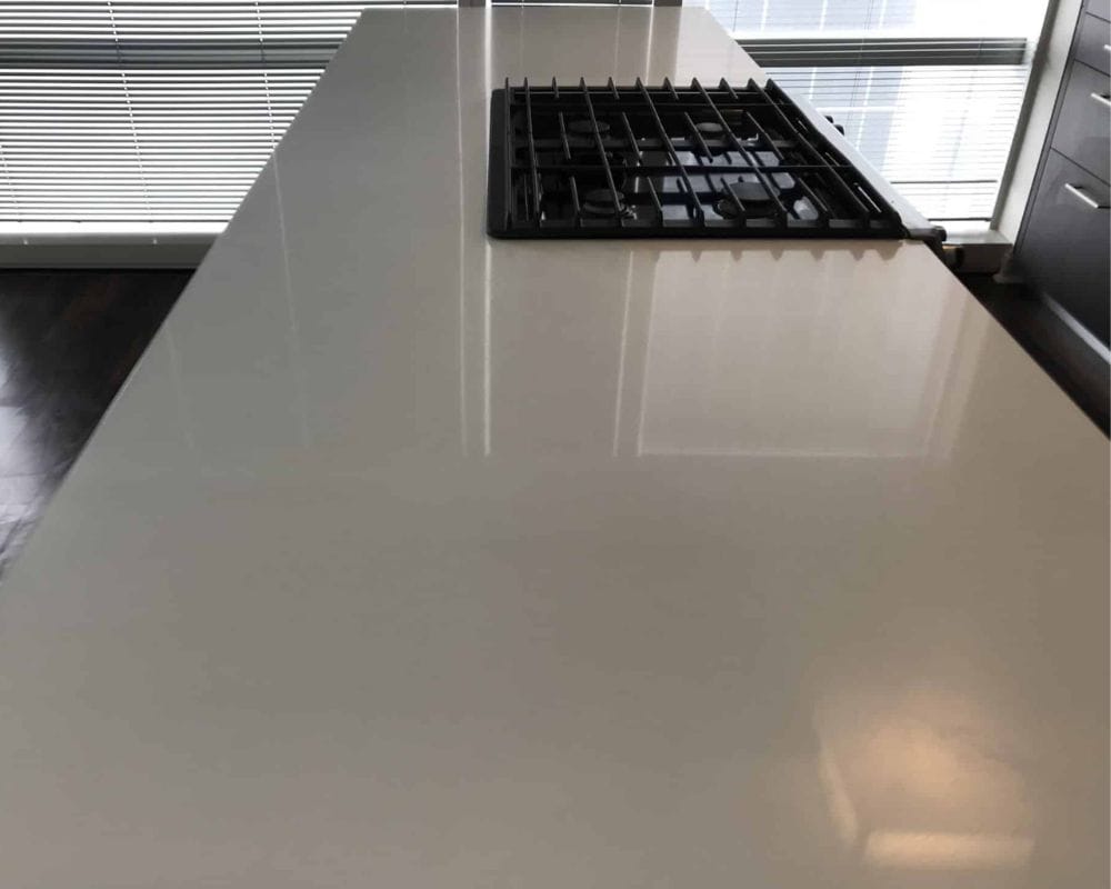
After some time, and a lot of water, they’ll lose their original luster, making them look ugly. You need something more durable and more modern looking in the kitchen.
All Gray
Gray was never really a favorite color, except in the 2010 decade, when people were convinced it was beautiful. It may start to be a bit more appealing when mixed with other colors, but everything gray?!
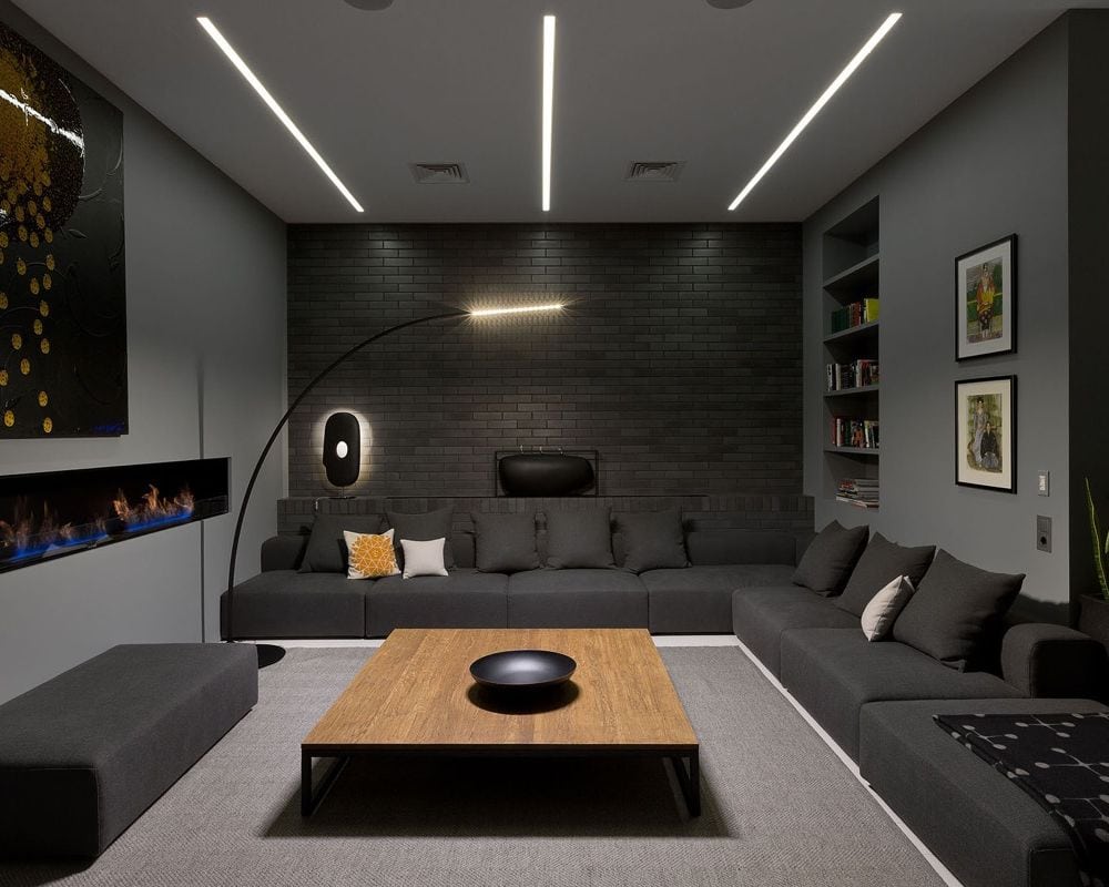
With gray floors and walls and everything else, you can start to feel quite depressed. While it may be considered better than going over the top with too much color, having too little color can be just as bad.
Cluttered Stairways
This photo gallery wall trend might sometimes look and feel a bit too cluttered. And for a good reason – it’s a tad overwhelming and a bit of an attack on the senses.
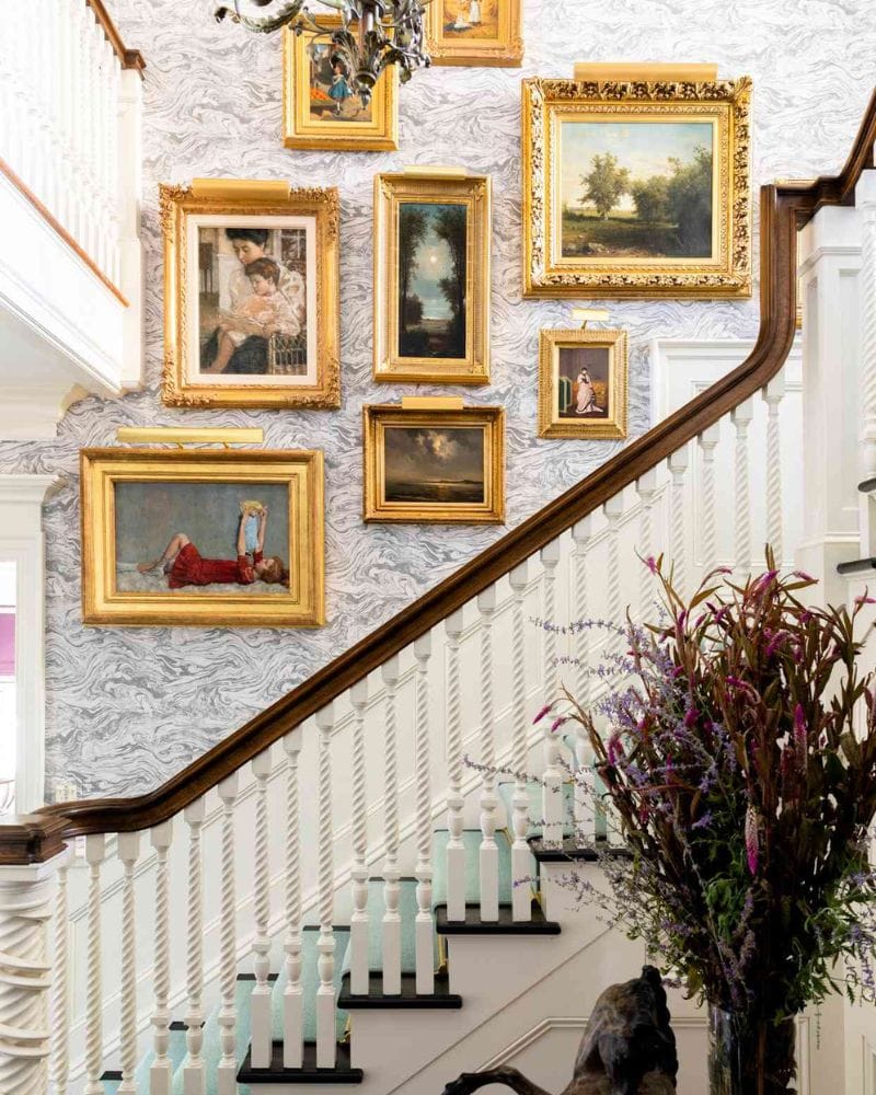
You may even feel like you’re in a private museum or something. Different colors and types of frames really add to this overcrowded look and feel. And what’s the point? Are you ever stopping to look at the pictures?
Shaggy Toilet Carpets
At some point in history, people decide to dress their toilets up in warm covers. Did they think their toilets were cold? Hopefully not. And while we understand not wanting cold feet, what’s the story with the lid cover?
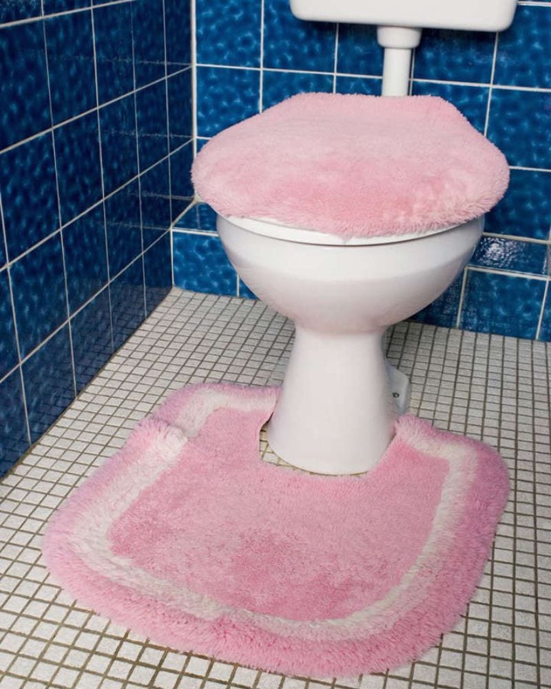
Luckily, this trend went out of style a while ago, which has thankfully left us with a bare and hygienic toilet. Those toilet accessories were definitely not hygienic or clean. In fact, we get the heebie-jeebies just looking at it. Ew.
Sometimes, people simply don’t even notice that some of their home’s decor is old and needs fixing. This includes anything from rugs to curtains and other outdated trends that look out of place today. Our mission is to show them what needs to be changed so their home decor can fit into the modern world. Let’s take a look at some of the outdated home decor found in people’s homes and remind ourselves that progress is necessary.